
San Francisco Fire Credit Union
In 1951, SF Fire Credit Union was founded by firefighters, for firefighters. After an expansion of membership eligibility to the broader community, SF Fire Credit Union established a reputation among locals for their exceptional service.
However, the message that the credit union had extended its charter of service from the firehouse to every house was not immediately clear. Additionally, SF Fire had attempted an unsuccessful move towards digital that left members feeling frustrated with their online relationship with the credit union.
On average, members were already engaging with the digital channel 60 times more than a physical branch and 40 times more often than with the SF Fire contact center. Translating the credit union’s storied high-touch service and unique values to the digital channel was crucial.

Homepage
Role: Lead Designer
Creative Director: Wolfgang Strack
UX Director: Paul Mooney
Lead Strategist: Linda Matthews
Lead Copy Writer: Cassandra Stumer
Lead Engineer: Pasquale Scerbo
The Goal
Create conversion and increase the number of members to join the credit union. The scope of the project included:
Update the Brand
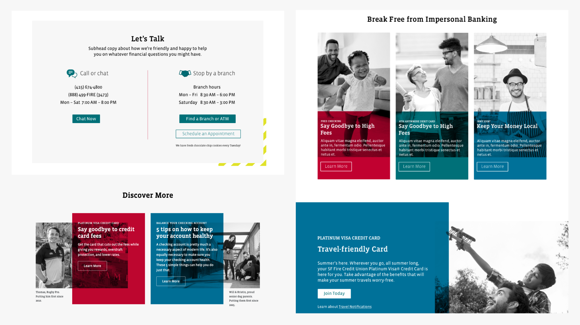
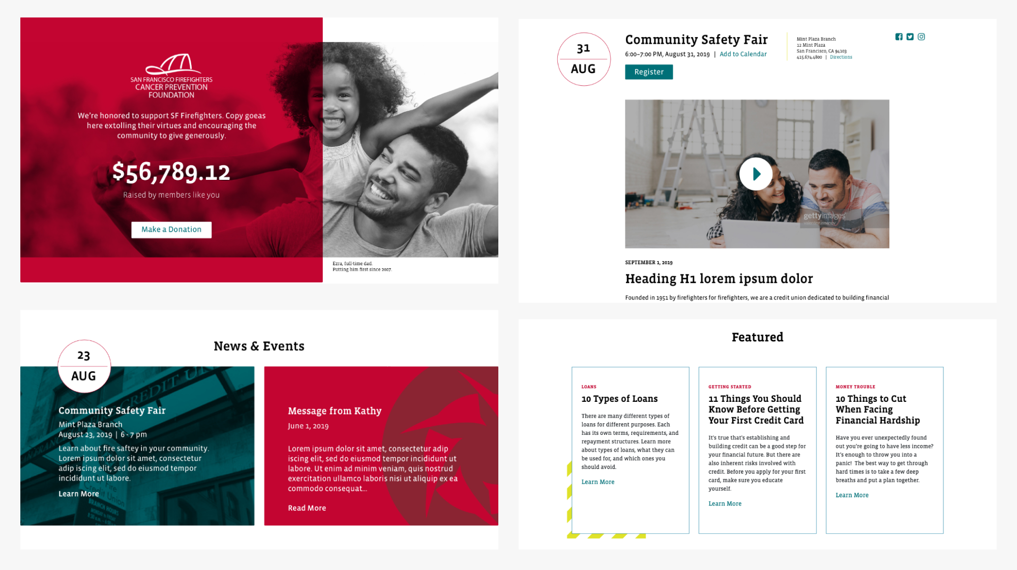
With its playful composition, jewel tone colors, sophisticated photography, and an updated typography family, we created a concept unique to, not only the SF Fire CU, but to San Francisco Bay Area. This work can be seen hereNew Website
We interviewed members, firefighters, and community leaders to inform our action plan. The UX team analyzed member behavior qualitatively, through user interviews and comparative market research. In parallel, the analytics teams gathered quantitative metrics about customer behavior with dynamic tracking; leveraging our years of specialization in financial services data analytics for comparative analysis.Utilizing a new CMS, I worked closely with both Paul and Pasquale to design, document, and QA the new site design. We started with a simple design system that would allow the client to use modules to build specific pages, from campaigns to content articles. Each page template was designed for specific type of content, which required myself and Cassandra to include details like word-count, image specs, and other guidelines to ensure the modules worked as intended.
Drive Growth with OAO
Drive growth through an optimized user journey, and that meant redesigning their online account origination (OAO) process.
New Look
Extractable worked with the SF Fire Credit Union Board of Directors and senior leadership to co-create a vision for the future. It was clear from SF Fire’s initial attempt at a digital initiative that the previous iteration did not dig deep enough to provide the necessary tools to empower members to achieve their financial goals.
We established a business case in which we would undertake top down digital transformation —
a shift that is oftentimes less about digital and more about changing the organization from the inside out. In order to delight members and remain competitive, Extractable had to accelerate both a digital and cultural transformation.

We followed a Lean UX process that allowed us to rapidly iterate. We went through multiple rounds of visual design to pick the direction and establish a new look and feel. This included a Style Guide, and Photography Guidelines, and to ensure everyone at Sf Fire CU, and its vendors, followed consistent rules.
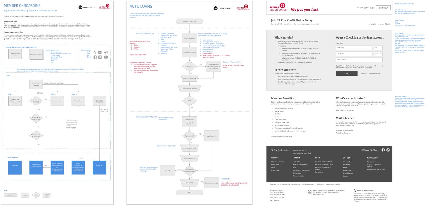
Designed with Users in Mind - OAO
We designed a seamless and user-friendly experience for Members looking to open an account with SF Fire CU Simplified Design. The goal was easy, get members to come for the coffee, and stay for the donuts.
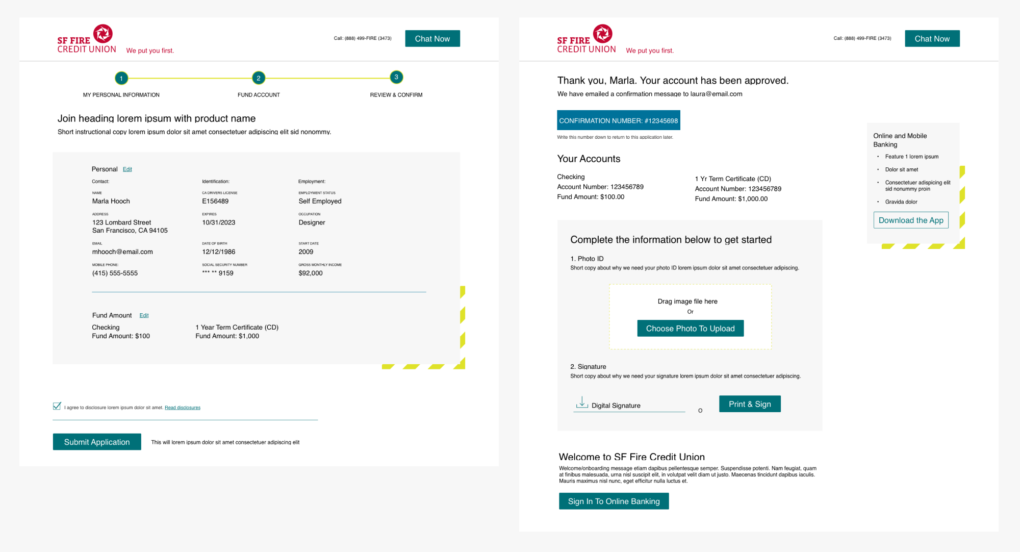
Personal Information
In order to have an account with SF Fire CU, you have to be a member. So at this point, we already have a little bit of information on our member, they either, live, work or worship within San Francisco city limits, and we know their name, allowing us to add some personalization to the form before getting started.
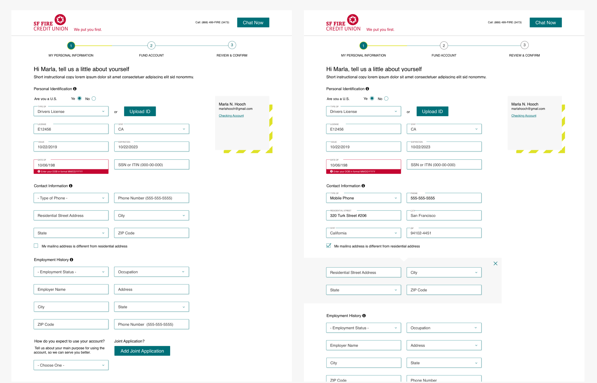
Step 1
Personalization for the Win
There is a right side margin to help members understand what they have signed up for, as well as providing tips, articles, and Financial Wellness content, depending on the account the member has opened. If Marla signed up for a loan, she would receive content related to said loan, if she opened a checking or savings account, the margin would be utilized as an indicator.

Step 2
Signed, Sealed and Delivered
“Our new brand honors our 68-year tradition of service and celebrates our vibrant community, while preparing our credit union for the future; our new look celebrates the history that inspires us and gives us the flexibility we need to make our brand accessible and inspiring.”
The Results
The combination of analytics, SEO, strategy, and site redesign has had a positive impact Sf Fire CU website's performance. Key factors include:
Improved User Experience: The site redesign can improve the overall user experience by making the website more visually appealing, easier to navigate, and more user-friendly. This has lead to higher engagement and better conversion rates, upwards of 56%.
Targeted SEO: By optimizing the website for specific keywords and phrases, we were able to attract more relevant traffic to the site. This has increased the likelihood of visitors finding what they are looking for and completing the registration process.
Data-Driven Strategy: Using data to guide our decision-making has helped us make more informed decisions about SF Fire CU’s website's design and content. Analyzing user behavior and feedback, allowed us to identify areas for improvement and make changes that better align with our client’s needs.